
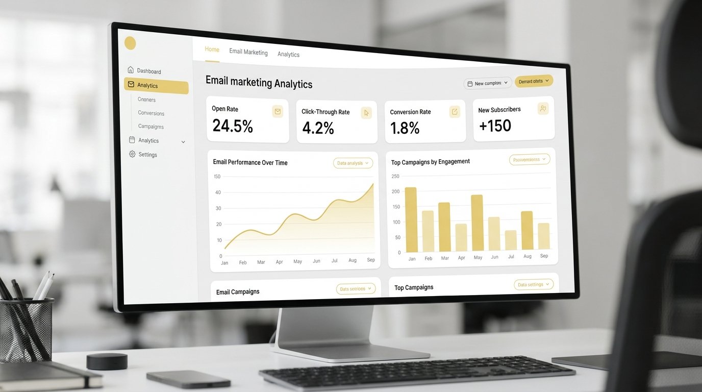

An email marketing dashboard pulls your campaign metrics into one screen: opens, clicks, conversions, deliverability. On its own, it only proves engagement. Connect it to your CRM funnel, and it shows which email activity actually produces qualified leads, not just impressions.
This guide covers which metrics actually matter, the four decisions behind building a dashboard from scratch, a free template you can copy today, and how the leading tools compare, then gets into where most dashboards stop short: turning those numbers into qualified leads instead of just engagement. Stick with it through the FAQ at the end, since that’s where the CRM connection ties everything together.
What is an email marketing dashboard?
An email marketing dashboard is a single screen that pulls your email campaign data (send volume, opens, click-through rate, bounce rate, unsubscribes, revenue per send) out of separate platform reports and into one place you can actually read at a glance.
Most email service providers, Mailchimp, Klaviyo, Brevo, HubSpot, ship a built-in reporting tab. A dedicated dashboard goes further. It pulls data from multiple tools, your ESP, your CRM, your web analytics, into a single view, so a campaign doesn’t sit isolated from the pipeline it’s supposed to feed.
For a founder or marketing manager running email alongside paid ads, social, and SEO, that consolidation matters more than any single metric. You’re not just checking whether an email performed. You’re checking whether email, as a channel, is pulling its weight against the rest of your marketing spend.
Most dashboard advice treats this as solved once you’ve picked a tool. It isn’t. The tool renders the data. It doesn’t decide whether open rate or cost per qualified lead deserves the top spot, and that decision is what separates a dashboard someone actually checks from one that gets built once and ignored.
Email marketing dashboard vs. CRM dashboard vs. digital marketing dashboard
People use these three terms interchangeably, and that’s where a lot of dashboard builds go wrong. Each one answers a different question, and mixing them up usually means someone ends up staring at open rates during a conversation that should be about revenue.
| Dashboard type | What it tracks | Primary user | When to use it |
|---|---|---|---|
| Email marketing dashboard | Campaign-level email metrics: opens, clicks, bounces, unsubscribes, revenue per send | Email marketer, content team | Daily or weekly campaign monitoring and list health |
| CRM dashboard | Deal stages, lead source, sales activity, pipeline value, close rate | Sales team, revenue leadership | Tracking how leads move from contact to closed deal |
| Digital marketing dashboard | Cross-channel performance: paid ads, SEO, social, and email combined into one view | CMO, marketing manager, agency | Reporting overall marketing contribution to the business |
An email marketing dashboard is a subset of a digital marketing dashboard, narrower in scope, but it should feed data into the broader view rather than exist as a standalone report. It’s also not a CRM dashboard, even though the two need to talk to each other: email tells you who engaged, CRM tells you what that engagement turned into. Treat them as connected systems, not competing tools.
Metrics every email marketing dashboard should track
Every ESP reports a different default set of metrics. Strip it down to the ones that actually inform a decision, and the list is shorter than most dashboard templates suggest.
- Open rate: how many recipients opened the email. Useful for subject-line testing, unreliable on its own since Apple Mail Privacy Protection inflates it.
- Click-through rate: the percentage who clicked a link inside the email. A better engagement signal than opens.
- Click-to-open rate: clicks divided by opens, not by sends. This isolates content performance from subject-line performance.
- Bounce rate: split into hard bounces (invalid address) and soft bounces (temporary delivery issue). Rising hard bounces signal a list-hygiene problem.
- Unsubscribe rate: a leading indicator of send frequency or relevance issues, before it shows up as a deliverability problem.
- Conversion rate: the percentage of recipients who completed the action the email asked for, whether that’s a purchase, a form fill, or a booked call.
- Revenue per send (for e-commerce) or cost per qualified lead (for B2B): the metric that ties the campaign back to a business outcome instead of an engagement one.
List segmentation performance deserves its own line too. A dashboard that reports blended metrics across your whole list hides the fact that one segment is carrying the results while another drags the average down. If you’re also running WhatsApp alongside email for follow-up, common in Indonesia, where WhatsApp often outperforms email for direct response, keep that channel’s numbers separate rather than folding them into your email metrics. They measure different behavior, and blending them muddies both.
Most of these live natively in your ESP. The conversion and revenue metrics usually don’t. They require connecting your email platform to GA4 or your CRM through UTM parameters and conversion events.
If that connection isn’t set up yet, start with GA4 tracking setup before building the dashboard around it. A dashboard built on incomplete tracking data just makes bad numbers look more official.
From email metrics to qualified leads: connecting your dashboard to the CRM funnel
A qualified lead is a contact who has shown intent to buy and fits your ideal customer profile, not simply someone who opened an email or clicked a link. That distinction is where most email marketing dashboards fall short: they report engagement, not qualification.
Here’s the gap in practice. A campaign posts a strong open rate and a healthy click-through rate. Everyone on the marketing side calls it a win.
But if none of those clicks turned into a booked call, a demo request, or a purchase, the campaign generated attention, not pipeline. Open rate tells you the subject line worked. It doesn’t tell you whether the offer, the audience, or the timing did.
Closing that gap means connecting three layers instead of reporting one:
- Engagement layer (your ESP): who opened, clicked, and how often.
- Intent layer (your CRM): who took the next step, booked a call, requested a demo, filled a qualification form.
- Outcome layer (your pipeline): who became a qualified opportunity, and which email touch was in that person’s path before they did.
Without the CRM layer, an email dashboard can only ever answer whether people engaged. Wiring your email platform into your CRM lead funnel is what turns that into proof the campaign contributed to revenue, and it’s the piece most off-the-shelf dashboard templates skip, because it requires connecting systems, not just displaying one.
This is also where marketing attribution earns its keep. Attribution models aren’t one-size-fits-all:
- First-touch: credits whichever channel introduced the lead.
- Last-touch: credits whatever happened right before conversion.
- Multi-touch: spreads credit across every interaction in between, so an email that nurtured a lead for three weeks before a sales call still gets counted, even though it wasn’t the final click.
Email usually looks weakest under last-touch models and strongest under multi-touch, where its nurturing role gets counted. Picking a model isn’t a technical afterthought. It changes which channel gets the budget next quarter.
Building this connection doesn’t require an enterprise stack. A CRM with custom fields for lead source and campaign, plus UTM-tagged email links, covers most of it. The heavier lift is deciding which stages count as qualified in the first place, since that threshold is specific to each business, not a fixed industry number.
If your current setup can’t answer which of last month’s qualified leads had an email touch in their history, the dashboard isn’t finished. It’s a campaign report wearing a dashboard’s name.
Not sure where the gap is?
See exactly where your email dashboard loses the CRM connection
A Growth Visibility Diagnostic reviews your SEO, ads, website, funnel, and tracking together, including where email data does or doesn’t reach your CRM, before recommending next steps.
Book a Growth Visibility DiagnosticHow to build an email marketing dashboard from scratch
Building one from nothing takes four decisions, in this order. Skip the order and you end up rebuilding the dashboard once you realize the KPI hierarchy should have come before tool selection.
Pick your data sources
Start with what you already have running: your ESP, your CRM if leads flow through one, and GA4 if you’re tracking on-site conversions from email traffic. Most dashboards fail here, not because the tool is wrong, but because someone tries to include a data source that isn’t actually tracked yet.
Choose a dashboard tool
Three tiers exist. Native ESP reporting works if you only need campaign-level metrics and don’t need to blend sources. A dedicated BI or dashboard tool, Looker Studio, Klipfolio, Geckoboard, Metabase, works once you need to combine email with CRM or web data. A custom build makes sense only once you’ve outgrown templates, which is rarer than most vendors imply.
Define your KPI hierarchy
Not every metric belongs on the same screen. Put three to five metrics that map to business outcomes (conversion rate, cost per qualified lead, revenue per send) at the top. Put engagement metrics (open rate, click-through rate, click-to-open rate) below them, as supporting context rather than headline numbers. This ordering alone fixes most of the wrong-number-on-top problem.
Connect to your CRM
This is the step most templates skip, and it’s the one that turns a reporting tab into an actual dashboard. Tag every campaign link with UTM parameters, make sure your CRM captures the source and campaign fields on lead creation, and set up a recurring pull, daily or weekly depending on send volume, so the dashboard reflects current pipeline status instead of last month’s snapshot.
The most common mistake at this stage isn’t picking the wrong tool. It’s moving to tool selection before finishing the data-source audit. A polished dashboard connected to only half your data sources still produces confident-looking numbers that are quietly wrong, which is worse than an unfinished dashboard that’s honest about its gaps.
Once these four decisions are in place, updating the dashboard becomes close to zero-maintenance. Most of the ongoing work shifts to deciding what the numbers mean, not collecting them.
Free email marketing dashboard template
A ready-made layout is more useful than designing one from a blank sheet. The core structure below covers the KPI hierarchy described earlier, built for Google Sheets, Looker Studio, or any spreadsheet-based tool.
- Header row: date range, campaign name, list segment
- Business outcome metrics: conversion rate, cost per qualified lead, revenue per send
- Engagement metrics: open rate, click-through rate, click-to-open rate, bounce rate, unsubscribe rate
- List health: growth rate, churn rate, spam complaint rate
- Notes column: what changed in this send cycle, subject line test, new segment, send-time change
This layout mirrors our free dashboard template, ready to copy and adapt.
Beyond the template
A template gets you started. A diagnostic tells you what’s actually broken.
If your dashboard numbers still don’t explain where leads are getting lost, Gwenchana’s Growth Visibility Diagnostic maps that gap across your funnel before you commit to a bigger fix.
Book a Growth Visibility DiagnosticFill in real numbers for two or three send cycles before drawing conclusions from any single metric. One send with an unusually high open rate is a data point, not a trend.
Best email marketing dashboard tools to compare
Tool choice depends on how much you’re already tracking outside of email, more than on any single feature list.
| Tool | Best for | Data sources it connects | Price tier |
|---|---|---|---|
| Native ESP reporting | Campaign-level metrics only | Email platform only | Included in ESP plan |
| Looker Studio | Free, flexible blending of multiple sources | GA4, Sheets, most major ESPs via connectors | Free |
| Klipfolio | Pre-built marketing dashboard templates | Email, CRM, ads, web analytics | Paid, tiered |
| Geckoboard | TV or office-display dashboards, simple setup | Email, CRM, spreadsheets | Paid, tiered |
| Metabase | Self-hosted, SQL-level control | Any connected database, including CRM exports | Free self-hosted, or paid cloud |
Budget matters more than the table suggests. Looker Studio costs nothing beyond setup time, which makes it the default starting point for most teams. Paid tools like Klipfolio and Geckoboard earn their subscription once you need pre-built templates and don’t have someone who can build connectors manually. For a solo marketer or small team, that trade-off usually favors starting free and upgrading only once manual setup becomes the bottleneck.
For a team already running social alongside email, the tool decision extends past email into the rest of the marketing stack. That’s a separate comparison covered in our best dashboard tools compared breakdown.
None of these tools fix a tracking gap on their own. Pick the one that matches your current data sources, not the one with the most features you’re not tracking yet.
Turn your email dashboard into a pipeline signal
An email marketing dashboard earns its place once it stops reporting engagement and starts showing pipeline contribution. Get the four build decisions right, connect it to your CRM, and the same dashboard that used to answer whether people opened an email starts answering whether that campaign produced a qualified lead.
If your current setup shows plenty of opens and clicks but can’t answer that second question, that gap is usually a tracking and attribution problem, not a content problem.
Ready to see the full picture?
Turn your email dashboard into a pipeline signal
Gwenchana’s Growth Visibility Diagnostic reviews SEO, SEM, social, website, funnel, and tracking together, so you know exactly where qualified leads are getting lost before committing to a longer engagement.
Book a Growth Visibility DiagnosticFor a broader look at what a full B2B marketing dashboard covers beyond email, see our b2b marketing dashboard guide.